Thursday, April 19, 2012

Another Layout for Graphic 45 and some Great News on my Classes at the Brisbane Expo


Here is a layout I did for Graphic 45. I love Graphic 45 papers and the way you can mix up collections and the colours still work. I like this kind of challenge when I scrapbook . This layout is one I have done for Josh, who travelled with me to the States this year. We had a great time at Disney land, where it is true that “magic still happens”. I have chosen papers from “play times past”, “Tropical Travelogue”, “On the Boardwalk”, “communiqué”, “Primer “and “ le Cirque”. Every time I do this  then teach the class, my students always say “I would never put those papers together”. That’s what’s great about Graphic 45, the different collections always work together. I have done a tutorial for you if you want to have a go.

Cut your black cardstock to10 ¾ x 10 ¾ inches. Keep the scraps as you will need it to back your 5 cent boarders.
Cut your Tiki Voyager to 10 inches by 10 inches
Adhered your black cardstock onto your I think I can, Making sure you have the same amount of I think I can all the way around. Adhered your Tiki Voyager to the middle of your black cardstock.

Cut the 5 cent board from by the beautiful sea. Adhered them onto the left over bits of your black cardstock so that you have a bit of black each side of them. Do all four pieces and put foam squares on the back quite close together. Add them to your page with a bit of the black cardstock showing on the outside, this will create a frame around your page. You will need to trim them back so they fit. Don’t put any foam in the corners just yet,  as you will need to glue your corners on and push a brad through them. Once you have done that you can add a foam square to the corners. My frame measures about 10 ½ x 10 ½ inches.


Cut a piece of On the Dot to 5 inches by 8 ½ inches and adhered it to your page inside the frame near the bottom. Cut a piece of Le Cirque to 4 inches x 5 inches and adhered it to your page near the top left corner as shown above. Add a photo corner to the top left corner of Le Cirque.
Insert photo 0059
Cut a piece of On the Dot with the stripes horizontal 3 inches x 4 inches. Adhered it to your page as shown above. Add your photo’s, mine are 4 inches x 5 inches and I matted them in black cardstock. Add two piece of film strip and use brads to hold them in place.

For my title, I used one from Imaginarium Designs. I inked with an olive green ink. Once it was dry I outlined it with Platinum glitter.  I used some small alphas and inked them with French blue and lightly touched them with a black ink pad. Once they were dry, I used Glossy Accents over the top. Once they were dry I glued them on top of the title “Magic”.

To finish the page, I inked a Imaginarium Designs fence with French blue and again lightly inked it with a black ink pad. I waited for it to dry and added some glossy accents, only on the upright palings. On the rails in between I used Platinum glitter and did little dots. I added a square from Building Blocks, I used the letter J for Josh. I used it to add my journaling and chipboard numbers which I inked black.
Materials used
Graphic 45 papers
G4500037 I think I can
G4500199 By the beautiful sea
G4500410 Tiki Voyager
G4000303 Le Cirque
G4500061 On the Dot
G4500373 Building Blocks
Imaginarium Designs Chipboard
Edward Corner
Magic title,
numbers
fence
3L Photo Corners – Black
3L Scrapbook Adhesives 3d Foam Squares
3L Scrapbook Adhesives tape runner
Black cardstock
Brads
Film strip
Glossy accents
Colour box French Blue and blackbird
Brilliance Pearl Olive

Thanks so much for looking.
If you are wanting to do one of my classes in Brisbane June Longweek end and didn't get in due to them being booked out so quick, then the news is good. The expo has extended my classes, so if your quick you should be able to get in
Have a great weekend
Jane

Friday, April 06, 2012

A big day today

Hello Everyone
It's a big day today for me with my work being featured on Paper Crafter's Library.

Graphic 45 and Paper Crafter's Library are having a blog hop with week. Each day Graphic 45 has been posting a sneak peek on their blog of one of the projects the design team has made for this blog hop. On Paper Crafter's Library they have been showing the whole project along with their own design team members project. You can even win prizes. What you need to do is is click on the over to the Paper Crafter's Library blog  to see some stunning  Tropical Travelogue Library creations and be sure to leave a comment for your chance to win a wonderful Tropical Travelogue prize pack. It is mine turn today, so here is my sneak peek. Its a mini album and box to keep it in.
The mini Album is for my son, who traveled with me to the USA earlier this year. I have made it with pockets to hold all the bits and pieces in, like tickets to shows and his name tag for CHA . I added some more pages so I could fit in about 40 photos.

Make sure you visit Paper Crafter's Library to see the whole project with some instructions and remember to leave a comment to go into the draw to win. I will post all the photo's plus some more instructions over the weekend.
I also have some sneak peeks of my Brisbane expo classes. You should be able to book into those classes in a day or two. I have place a link on my right side bar and some photo's .
Well that's all for now,
Thanks for looking and have a safe and happy Easter.
Hugs
Jane
I am selling some of my projects as kits at Seriously Scrapbooking. Each month I will be putting more kits online.

My First Post on 3L Adhesives Blog

 For my first project for 3L, I decided to use a photo of Anna taken at her 21stbirthday. I love altered art projects, so I decided to use one from Imaginarium Designs. It is one of their altered art kits called billboards- “you light up my life”. This is would be the perfect project for sitting on a desk or bookcase and would make a lovely gift. You can theme it for any occasion, I have made them for baby gifts and even Christmas table decorations.  I always ink around the edges of my papers before I stick them down as I like the look and find it hides the white edges. I find that Colorbox fluid chalk ink pad in the cats eye shape to be the best. For this project I used olive pastel.

I used papers from Teresa Collins collection called Fabrications. The papers from this collection are thick and have a linen look to them. They are also double sided, so choose which patterns you like.
www.teresacollins.typepad.com
For this project I used 3L Adhesive Sheets, this makes covering the chipboard project quick. I used it for the larger pieces of my project, manly the front and back pieces of the billboard part. I placed a piece of print paper slightly larger than the chipboard shapes onto the adhesive sheet. Lay the chipboard shapes on top and trace around the shapes. You can neither cut them out with scissors or peel the backing of the adhesive sheet and stick them down. You run then around the edge with a craft knife.


For the two base pieces, I found the E-Z runner work perfectly for this, as the runner is made up of small rectangles this lets you go around a curve. I put the tape onto the chipboard and taped them down to my print paper, then ran around the edge with a craft knife.

 Use the E-Z runner to tape the two bases together.


Use the tape runner and cover the two stands with print paper, these then push into the bases and let you insert the billboard between them.

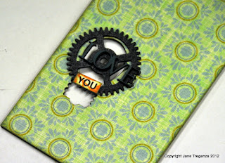
I added a chipboard cog which I inked black and the word“you” which I printed onto the print paper and cut it out.

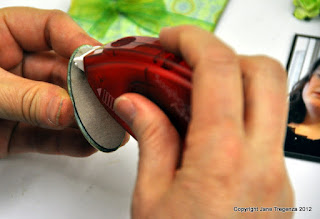
I used a large butterfly disk from K&Co and stuck it onto one of the print papers. I traced around it and cut it out. I used the tape runner again as I wanted to stick it onto the small oval chipboard shape and need to go around the curve of the chipboard.


Then I adhered it to the top of my billboard, again I used the E-Z tape runner.

  I matted my photo onto black Bazzill. I added a photo corner to each corner of the matted photo then stuck it down again to another pieces of black Bazzill. I love photo corners and use the black one’s on nearly all by projects and layouts. I like the classic look it gives to my work. I used 3 large size 3D Foam squares (black variety), I love these squares and use them by the packets. I like the fact that this packet comes with two different sizes. Big ones for larger areas and small ones for my mini projects. I adhered the photo to my billboard on a slight angle.
For the flowers and leaves I used DodzRepositionable for the quote first to make sure it would fit, once I worked out where it needed to go, I removed one word/phrase at the time and used the E-Z Runner permanent tape to adhered them back down. The finished size of this project is about 6 inches high and 3 ½ inches wide.

01615 3D Foam Squares Black Variety
01300 Dodz Small

01644 E-Z Runner
01626 Photo corners black
3L scrapbooking Adhesives, certainly made this project quick and hassle free. They have an adhesive to cover any situation you may find yourself in when making a mini project like this. Whether you need your adhesive in big sheets to cover large areas or small pieces to go around curves, they have got it covered!

Imaginarium Designs - Billboard – You light up my life
IDW0026 Love, Cherish, and Adore
Teresa Collins Print papers
FAB101 Floral Garden
FAB103 Yellow Flower
FAB106 Petite Flowers
FAB109 Ornate Circles
KC3059451 Floral and Fauna butterfly Baubles
Colorbox fluid chalk inkpad – olive pastel
Vandoros Ribbon
Black Bazzill
Please visit 3L Adhesives Blog and leave a comment for me.
Thanks for looking, I am on another blog today as well, so I will post again later today.
Jane